Branding
The brand was in its infancy when I came on board and looked much like a real estate brand with large solid blocks of color predominate. The brand needed to mature, so I began adding “cyber” imagery throughout. The company moved to a new space in the Crescent, and branding was needed everywhere. See Signage below. I even created videos to play on the coffee machine screen.
Deliverables
I helped increased lead generation with banner ads, paid media, and even personal contacts. I designed brand elements applied to website, social media, magazine inserts, digital and print collateral, ad specialties, presentations, icons, internal signage etc. Promoted the CEO’s book, created and produced videos plus still photography. Produced trade show materials. Generated everything from campaign strategy down to t-shirts.
Advertising
Brand awareness was low, and I proposed two campaigns. The FOCUS campaign used metaphors and a common graphic to tie the ads together. The EXPERTS campaign centered on the amazing cybersecurity pedigree of the principals (FBI, Homeland, Police, State Troopers, the White House, the Olympics and G7 summit) the main reason clients bought our services.
As these brand awareness campaigns were being developed, we executed an auto dealer campaign, to create lead generation. The ebook CTA generated the highest response rate.
Collateral
The brand elements I created really come together in the collateral.
One-sheets
The branding evolution was subtle. Here is a side-by-side comparison. The huge headline and logo are reduced, The cyber imagery is introduced in the background, the subhead changes from all caps to upper and lowercase, and there is more contrast in the color block behind the body copy.
Ebook | See the whole book
This was sent electronically, and later as a printed insert as part of an auto industry newsletter. | See the whole book. Wait for it to load all the way; lots of postscript involved.
Pocket folder
In addition to the new cyber elements, I proposed introducing more warm colors into the palette. On the color wheel, orange is a complementary color to blue. Classic color schemes always sell.
Videos | See the videos
The new branding was introduced into the videos. I created a mix of live action and all animation clips. Some videos were based on existing footage or animation. Some I created from scratch, from storyboards to final edit. I’ll be happy to discuss what I did for each. | See more videos.
Social Media
The graphic style was in place before I arrived. I added a bit more “cyber” branding where appropriate. Here are some hand-picked social media images, out of over a hundred or so. There are expected posts, plus blogs and a series of Tuesday Tips.
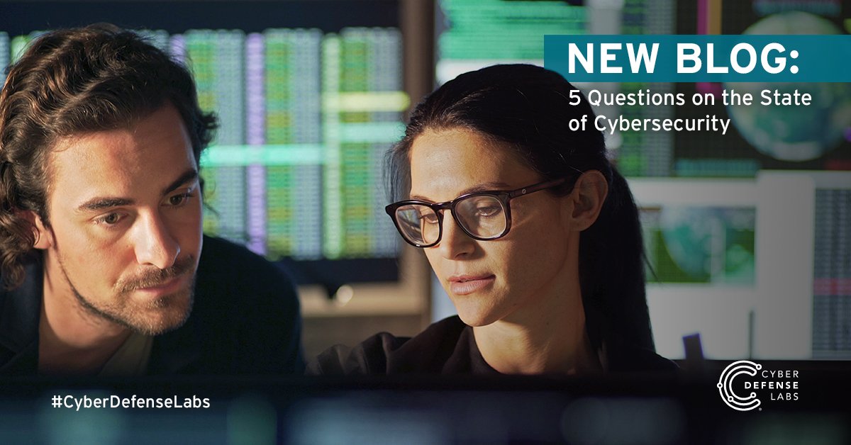
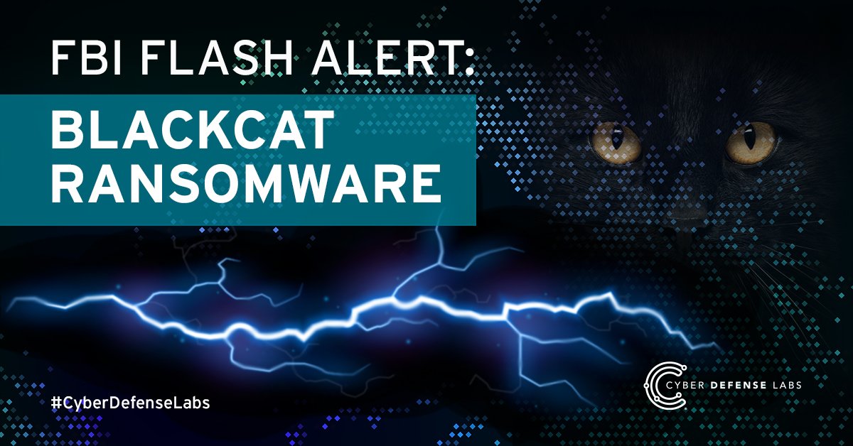
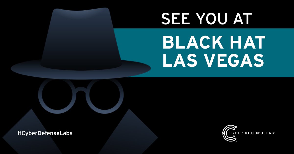
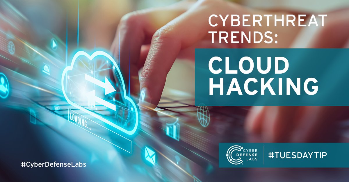
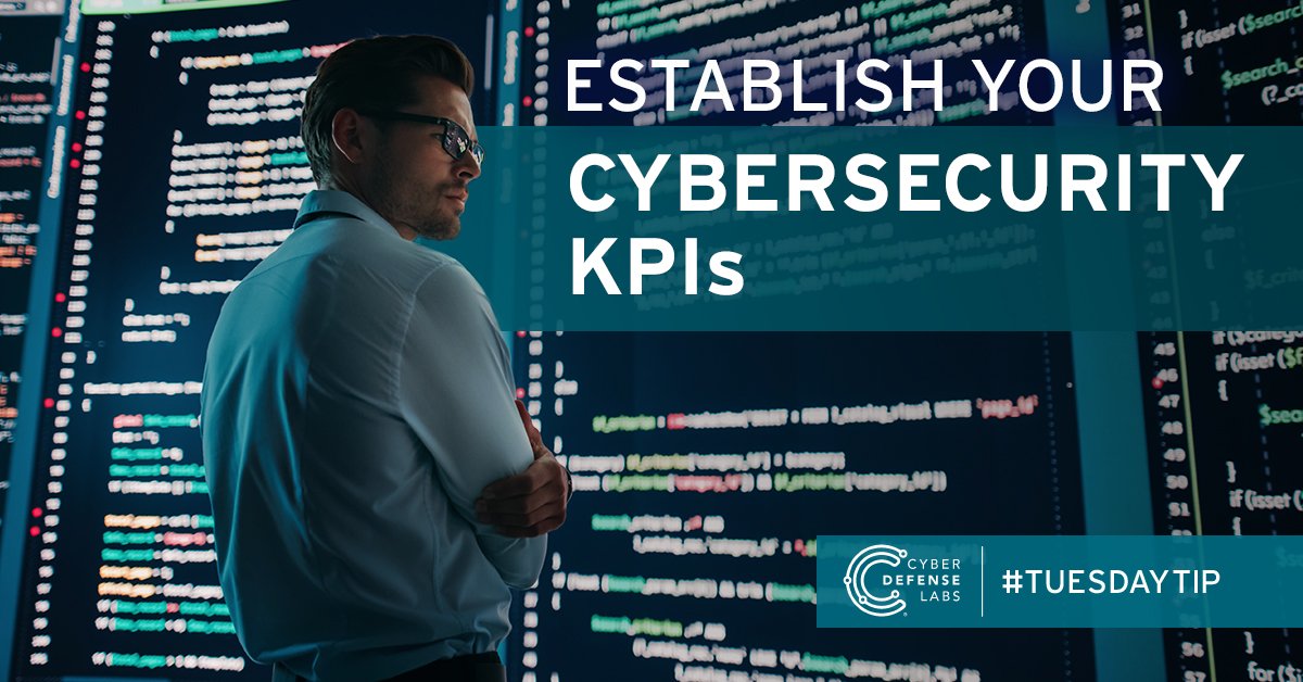
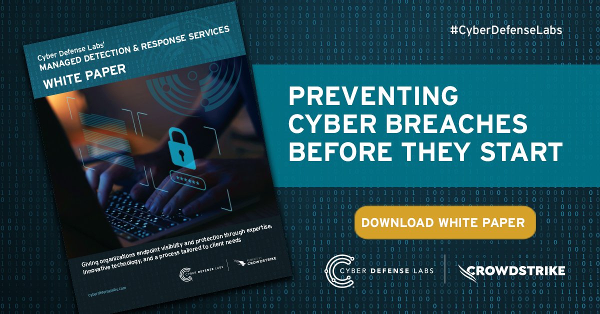
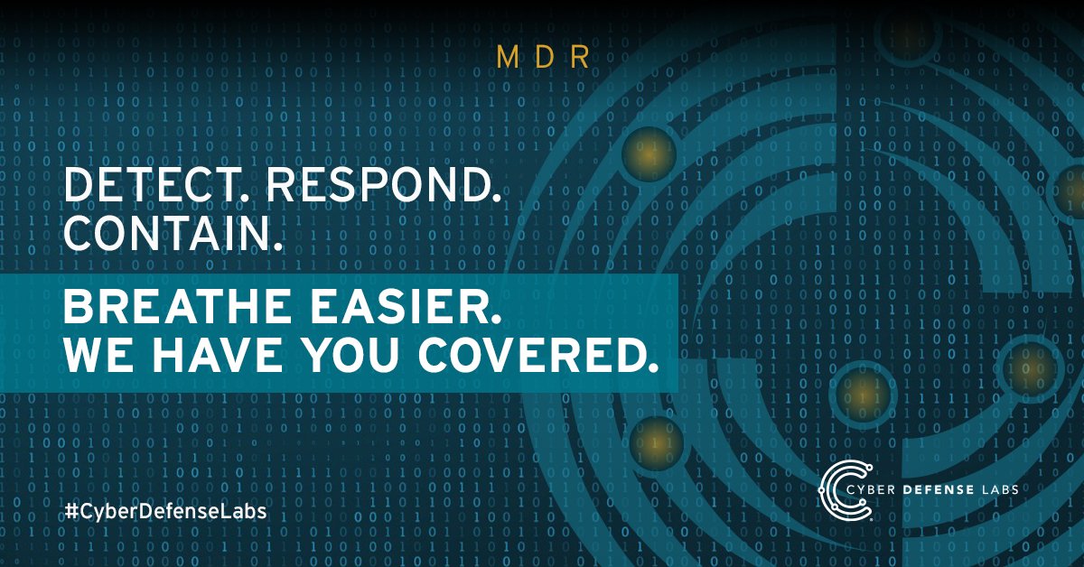
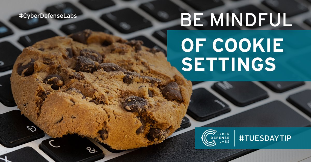
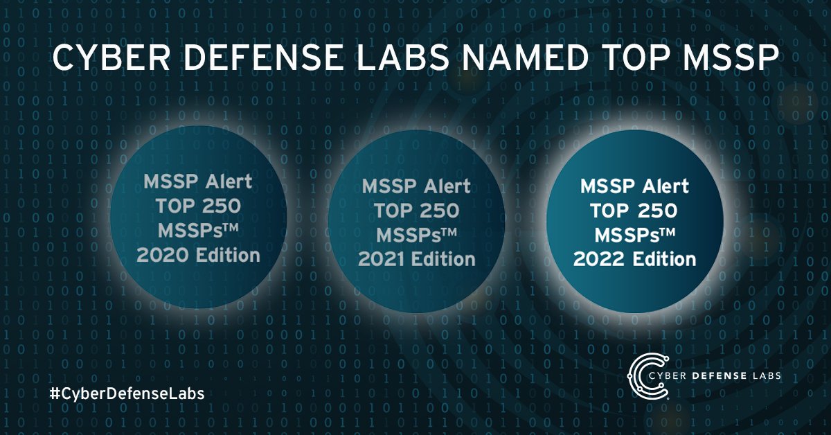


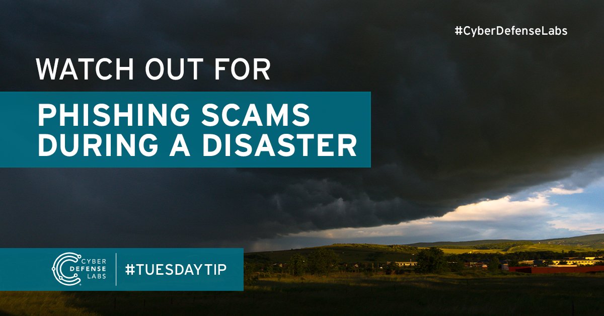
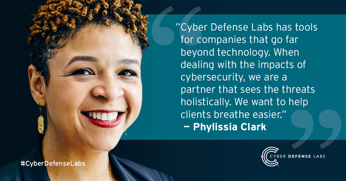
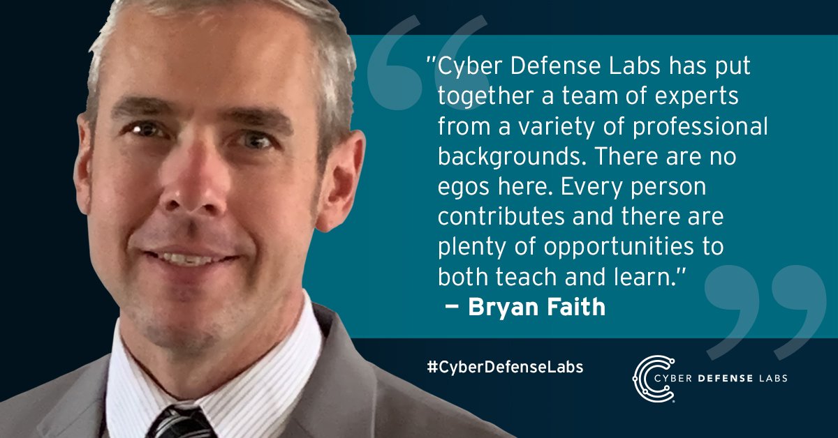
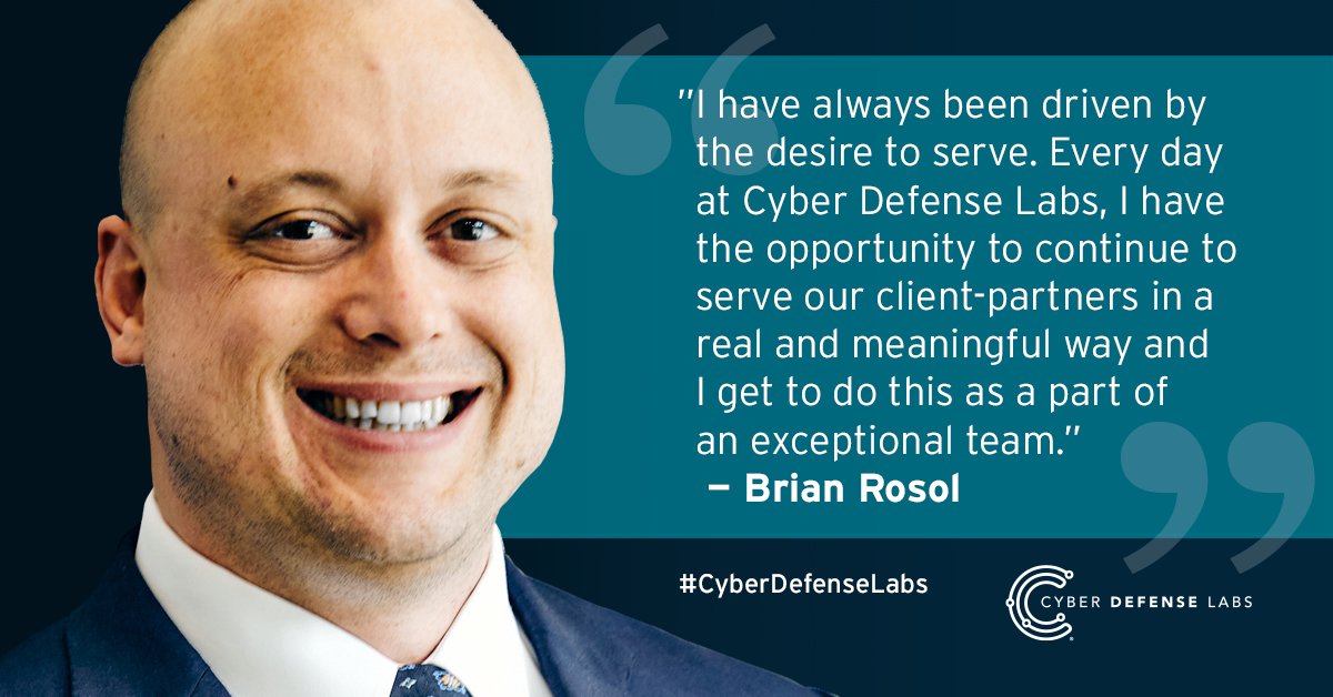
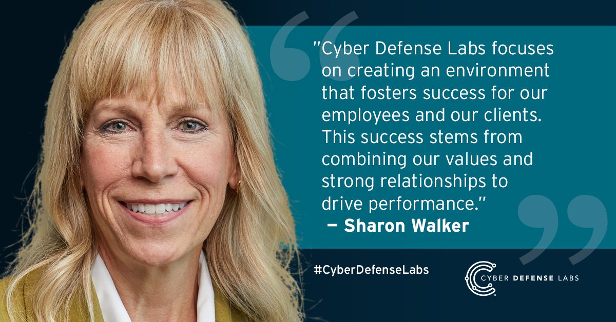
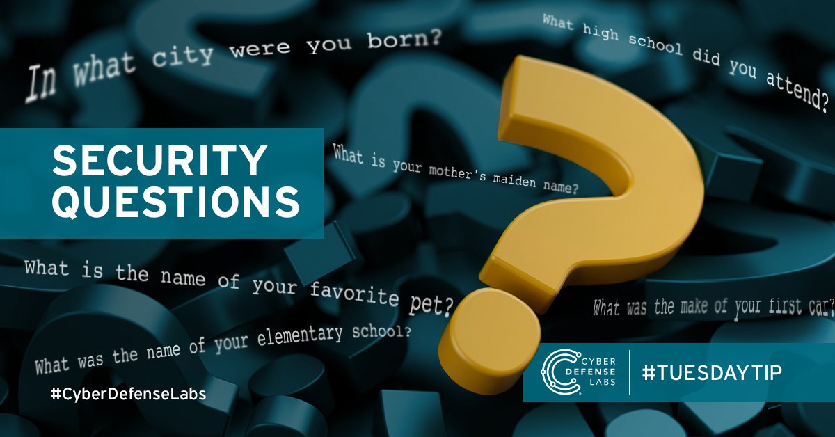
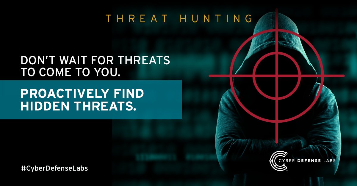
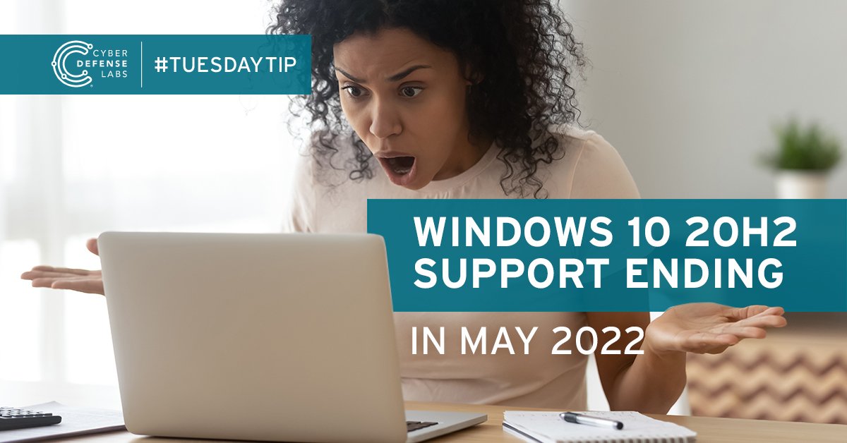
One of many animated social posts.
Signage | See the signage
Branding the office was hard work, but also exciting. A new “finish out” allowed me to start fresh, adding to the “industrial” look that was chosen. Rather than overusing the teal palette, metal and plexiglass materials were used with hints of the palette. It was important to the executives to incorporate the vision, mission and core values of the company for both clients and employees. | See more signage, including designs for the SOC (Secure Operations Center).
