The AGILE campaign
AGILE is a “hero” product, and the first major project I worked on. It had been started once before. My team said “There’s no way HQ will approve these layouts.” I said, “Our job is to execute the vision, and we’ll see what happens.” It got done, due in no small part to my managers, but it was a challenge.
“One of the bosses said, “If we sell ten of these in the next year, I’m taking you all to Hawaii.” We sold many times that, but we’re still waiting for that trip…”
In this case, AGILE is a combination of software and touchscreen hardware that does four things. It makes larger building elevators more efficient four ways. 1. It helps people get to their floor more efficiently than standard elevators, particularly in medium to large buildings. 2. It contains a management center, allowing building managers and engineers to tweak elevator service to suit their needs. 3. Security access – fairly self explanatory, but AGILE’s version is sophisticated. 4. The kiosk’s displays can be customized easier and faster than the competition, even from a tablet device. You customize messages to say things like, “Happy Birthday Mary!” when Mary swipes her access card. We’ll start with the brochure; to see a complete pdf, click on the image.
AGILE brochure
We started with the brochure, as they tend to be more comprehensive than other pieces. This brochure is a summary of what the product does. It was exhilarating to work directly with a 3D artist/photographer to create a brochure without a real prototype on hand. All the AGILE materials were created from drawings and stock photography.
AGILE Tenant handout and posters
These “how to” instructions are available for office managers to help technically challenged tenants.
AGILE for BOMA tradeshow
BOMA is a large Building owners and management tradeshow. To support our newest product at the show, we inserted this ad in the show publication. It helped peak interest in AGILE.
AGILE augmented reality
We worked with a third-party to create an app for AGILE. Using a tablet, a designer, engineer or building manager can see what the kiosk will look like in their existing environment. No need for sales to lug a huge case of products to the client. Size and color options can be chosen and viewed in 3D. The kiosk appears where desired as if it were really on the wall or on a pedestal in the elevator lobby. The image can be captured and emailed once the desired configuration is reached.
AGILE Design Center Brochure
This module has the greatest competitive advantage over similar offerings on the market. Surprisingly, it is difficult for competitors to customize their screen graphics. Also, other manufacturers have fewer default choices. Most require a technician to customize the screen graphics. Not so with AGILE.
AGILE Security Access Brochure
AGILE security can either expand or integrate into existing systems. It can also provide comprehensive access. It has a standalone option and a building integrated option.
AGILE Management Center Brochure
The team had trouble finding imagery on this one. I stepped in with some hands-on work to get it going. With the Management Center a building owner can capture metrics (traffic data) and respond to daily demands if needed. It also provides diagnostics, analysis, performance data, and remote access to the system. Essentially all the nuts and bolts accessible to the owner or engineer can be accessed through this module.
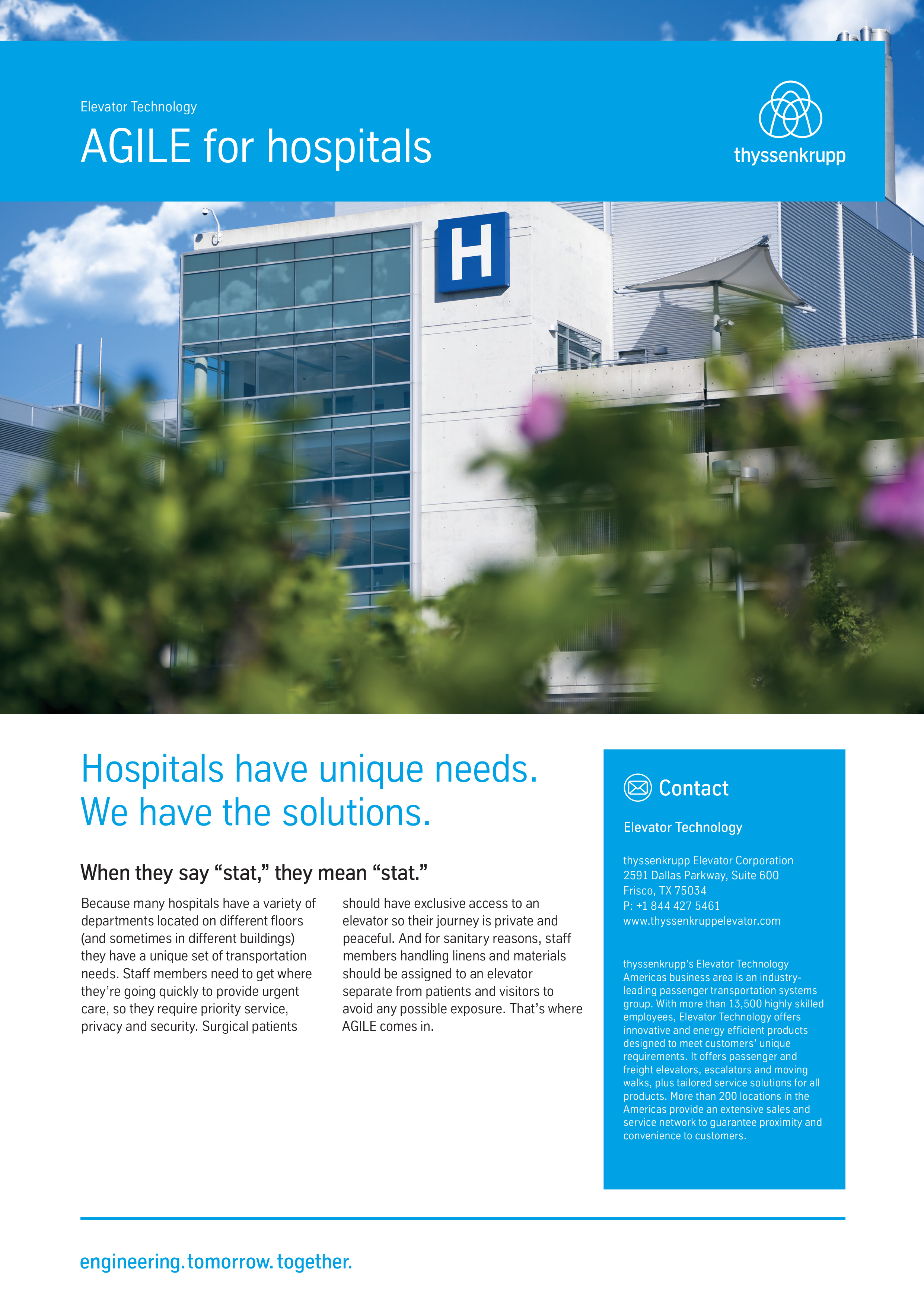
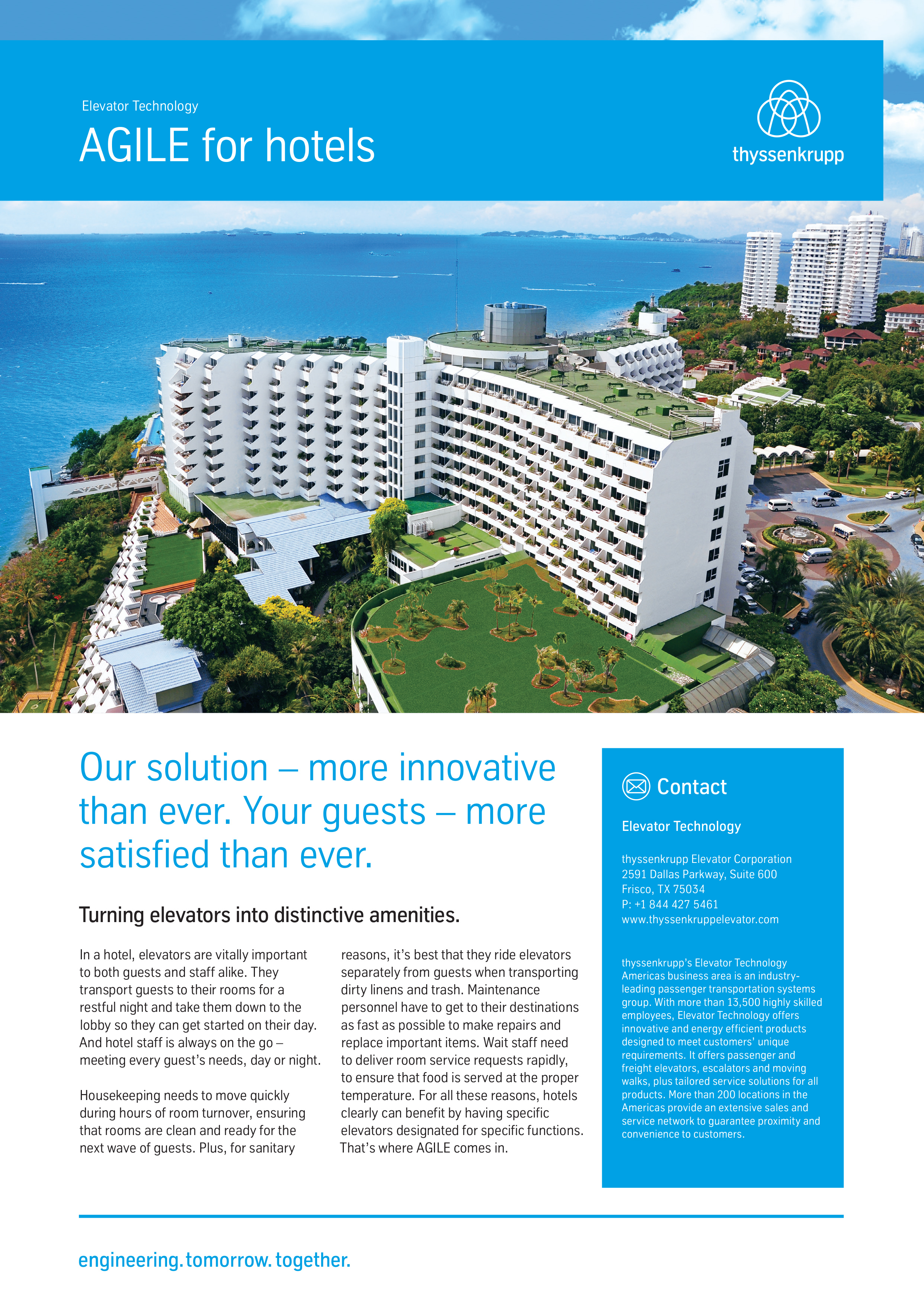
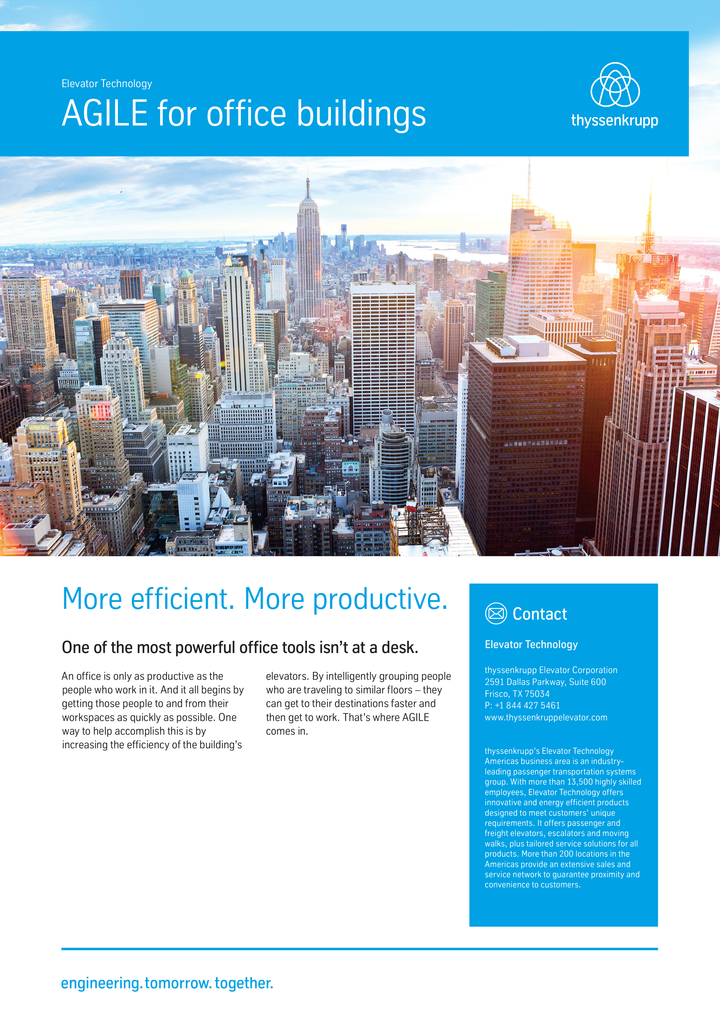
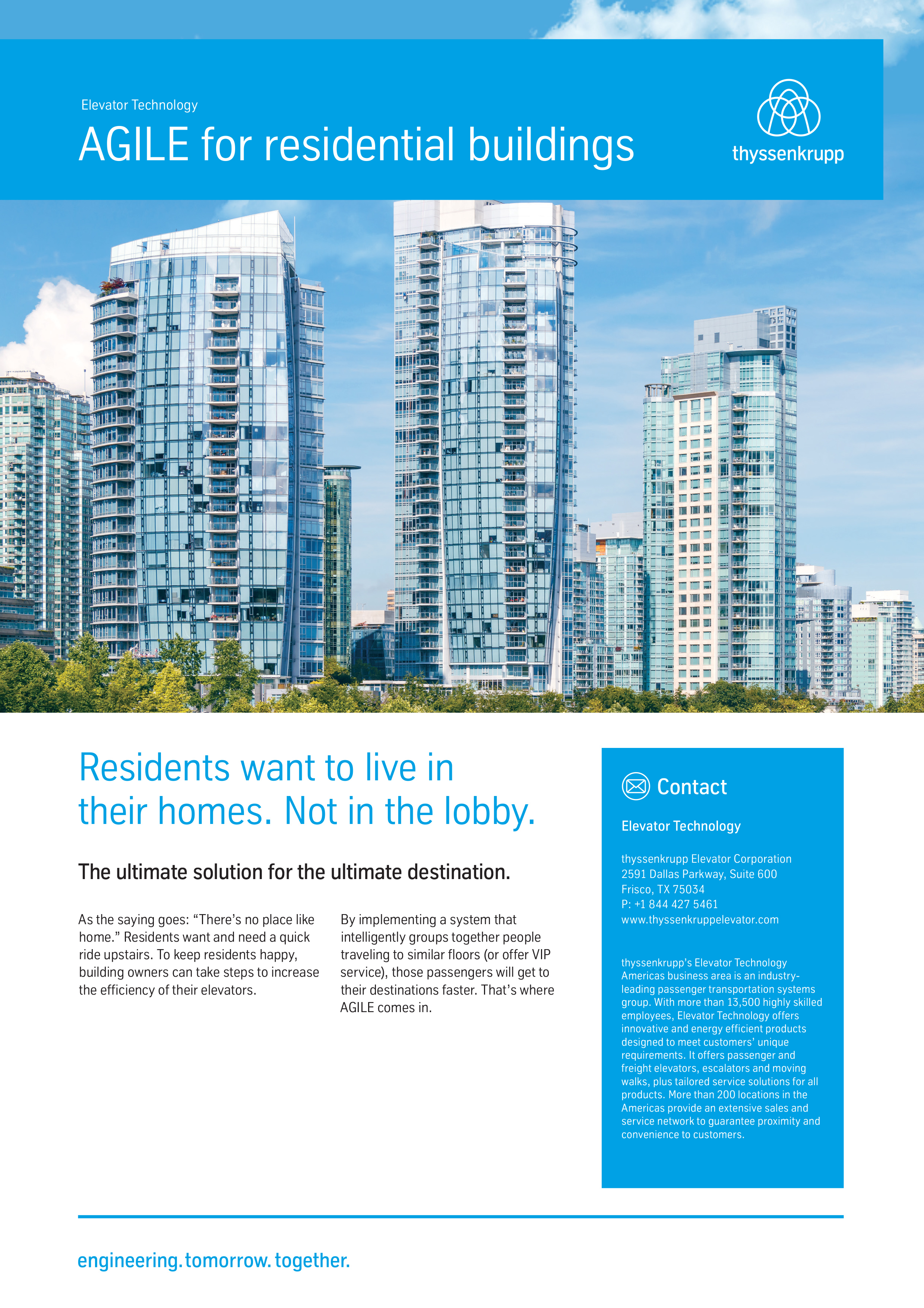
AGILE Customer Segments Cut Sheets
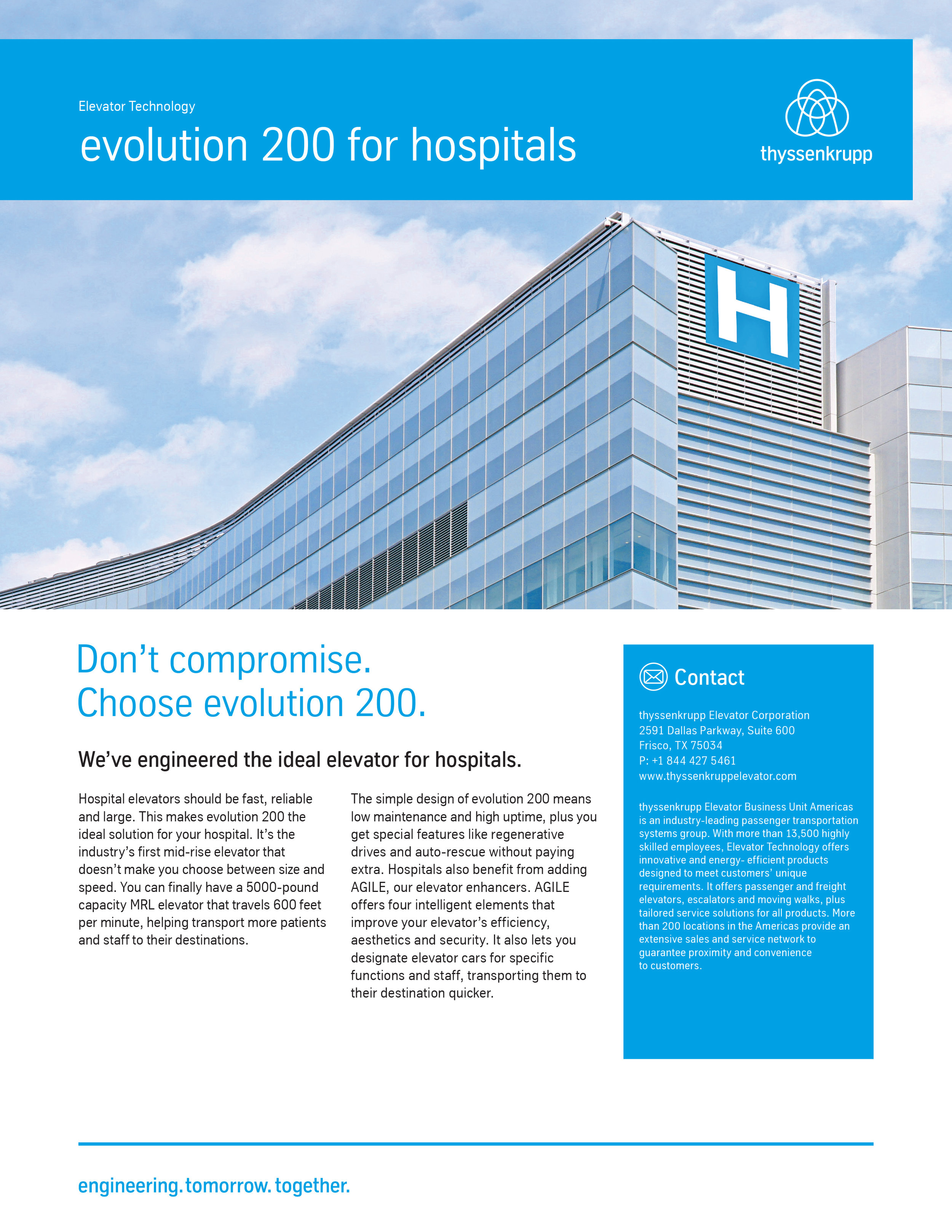
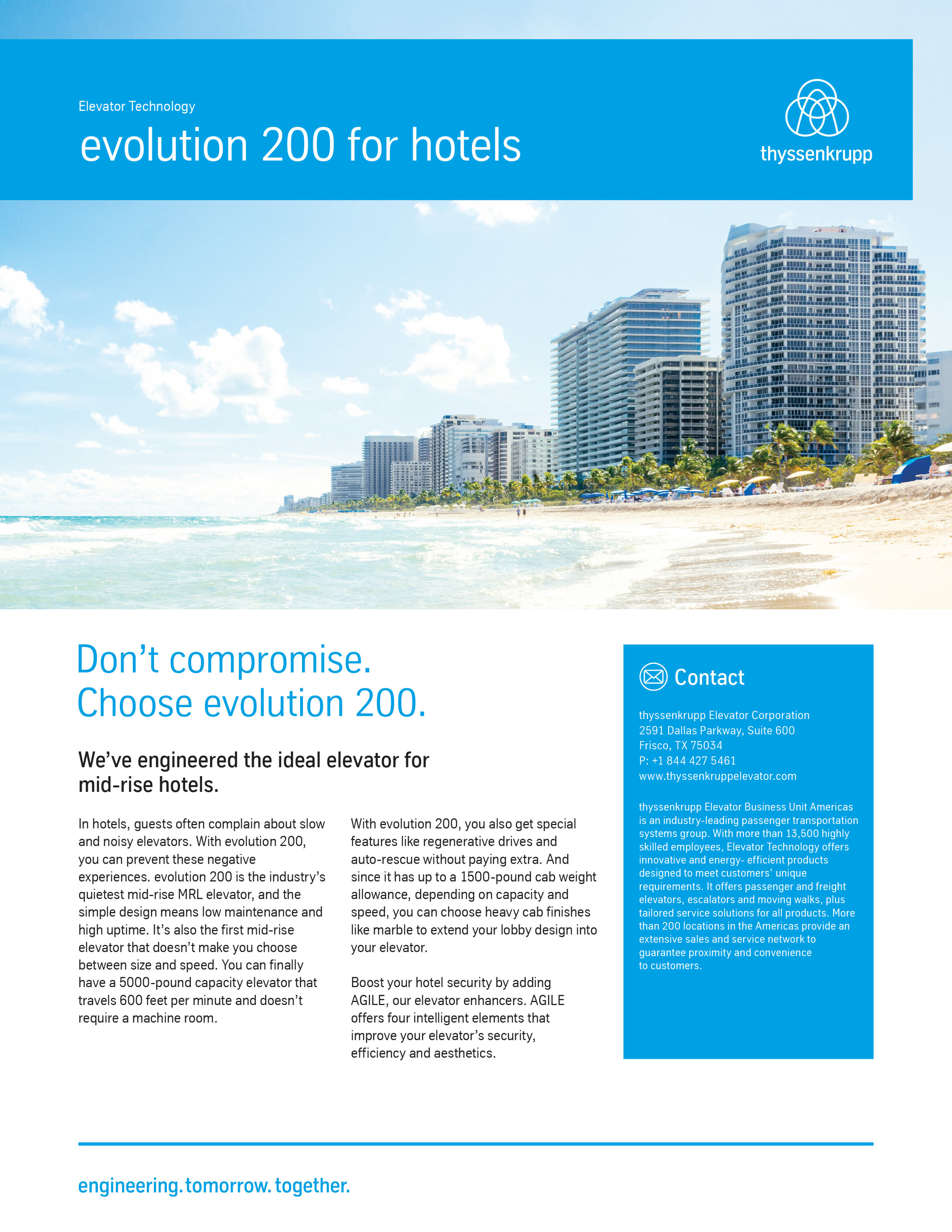
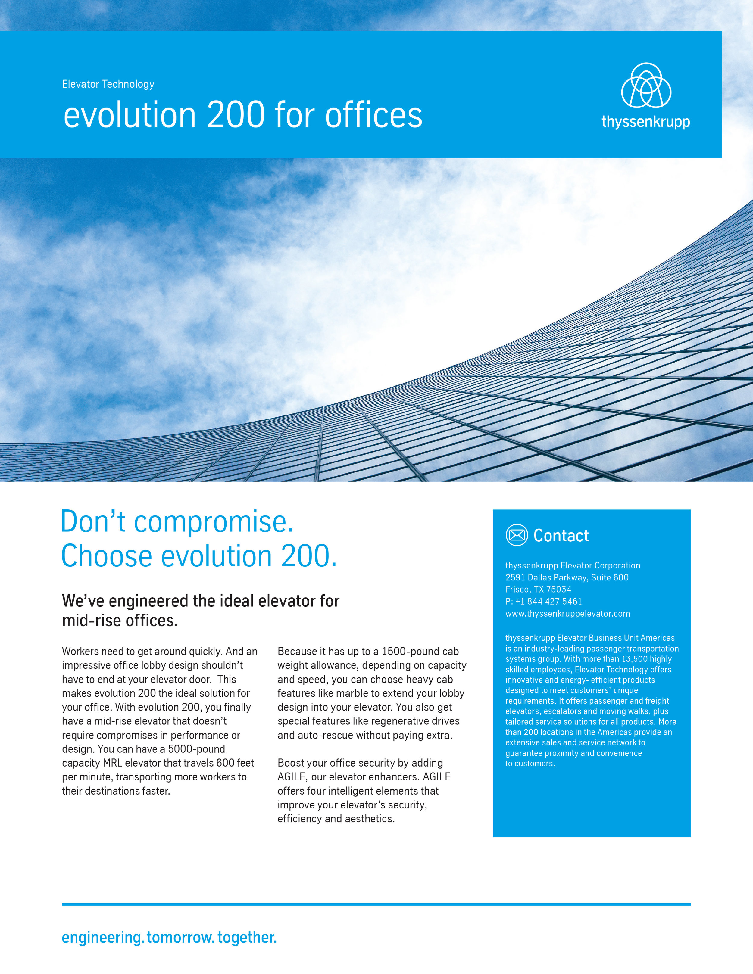
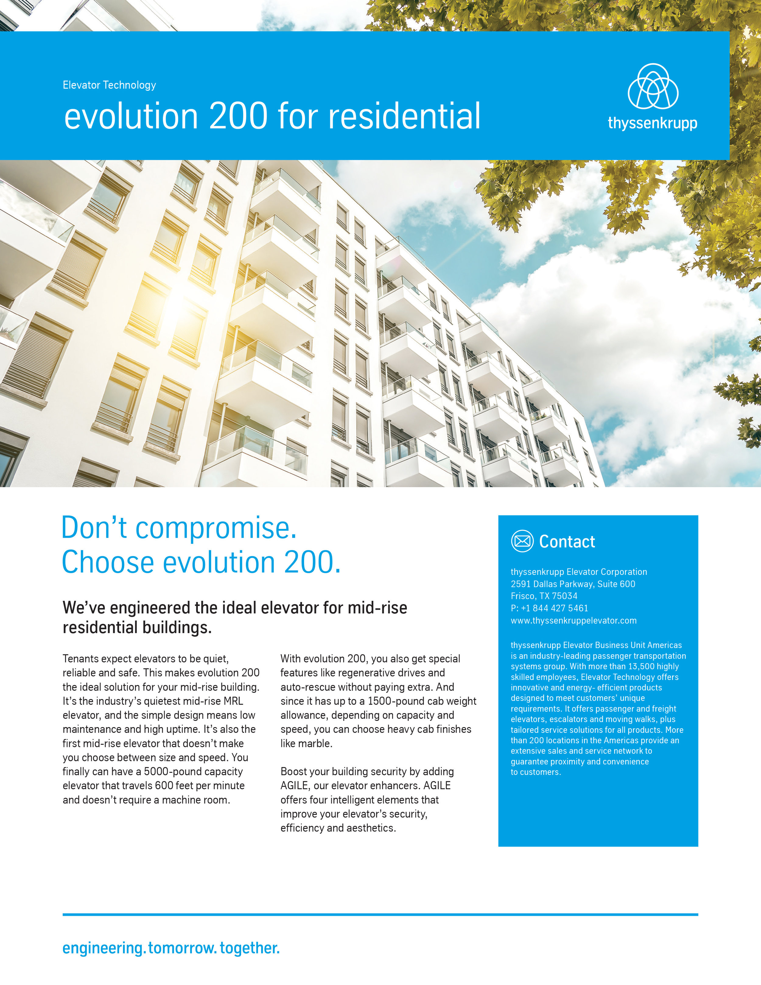
We created “sell sheets” or “one sheets” for each vertical customer segment. These include hospitals, hotels, office and residential.
AGILE Destination Control Brochure
This piece was a challenge for part of the team. I had to step in after several design rounds and finish it out. Typically called “Destination Dispatch” in the industry, this is the kiosk and touchscreen passengers use to select their floor. This piece evolved into a hardware catalog, all created in 3D. When we finally received prototypes, we were nearly done.
AGILE Pocket Folder
To hold several pieces of collateral, I designed this capacity brochure – magnets and all – to hold both standard US letter and European A4 size documents for AGILE. Since it is not designed as product specific, it flew off the “shelves” of our distribution site and has since been reprinted, well after the campaign.
The evolution campaign
The evolution 200 launch was the second large project I was tasked with. (Yes I ended a sentence with a preposition but it sounds weird the right way). This is a true elevator product and, for thyssenkrupp, a catch up product. We saw a prototype in the test tower near Memphis, but once again the real magic came in the form of renders. Most of the pieces were presented at an internal sales launch, then released to the market. Of course the department developed an email campaign and some of my team worked on the web page and promotional home page graphics.
The evolution 200 brochure
This piece features a “fold up” rather than a classic centerfold, as the product is vertical in nature. This device allows us to showcase a summary of the most important features of the product. Click on the image to view the pdf.
The evolution 200 owner’s manual
Owner’s manuals come standard, even with elevators. This one looks nicer than most.
The evolution 200 market segment “one sheets”
We created two-sided “sell sheets” or “one sheets” for each vertical customer segment. These include hospitals, hotels, office
and residential.
More thyssenkrupp individual pieces
Apart from the campaigns above, here are some important marketing pieces.
The Cab Finishes Guide
The Cab Finishes Guide shows a prospect the variety of colors and materials they can choose for the inside of the elevator.
The elevator “brains” one sheet
Elevator technology has slowly moved to the digital age compared to other industries. This “cut sheet” explains the benefits of this particular controller. More importantly, it explains what used to be a refrigerator-sized piece of equipment no longer needs a separate room of its own, but can fit inside the elevator door. The benefit is more space to be leased for the building owner.
The thyssenkrupp product guide
This catalog is widely used in the field as a sales tool. We created this English Imperial version shown, plus and English Metric and a French Canadian Metric. The pdf is interactive.
Sonesta Hotels Tradeshow ad
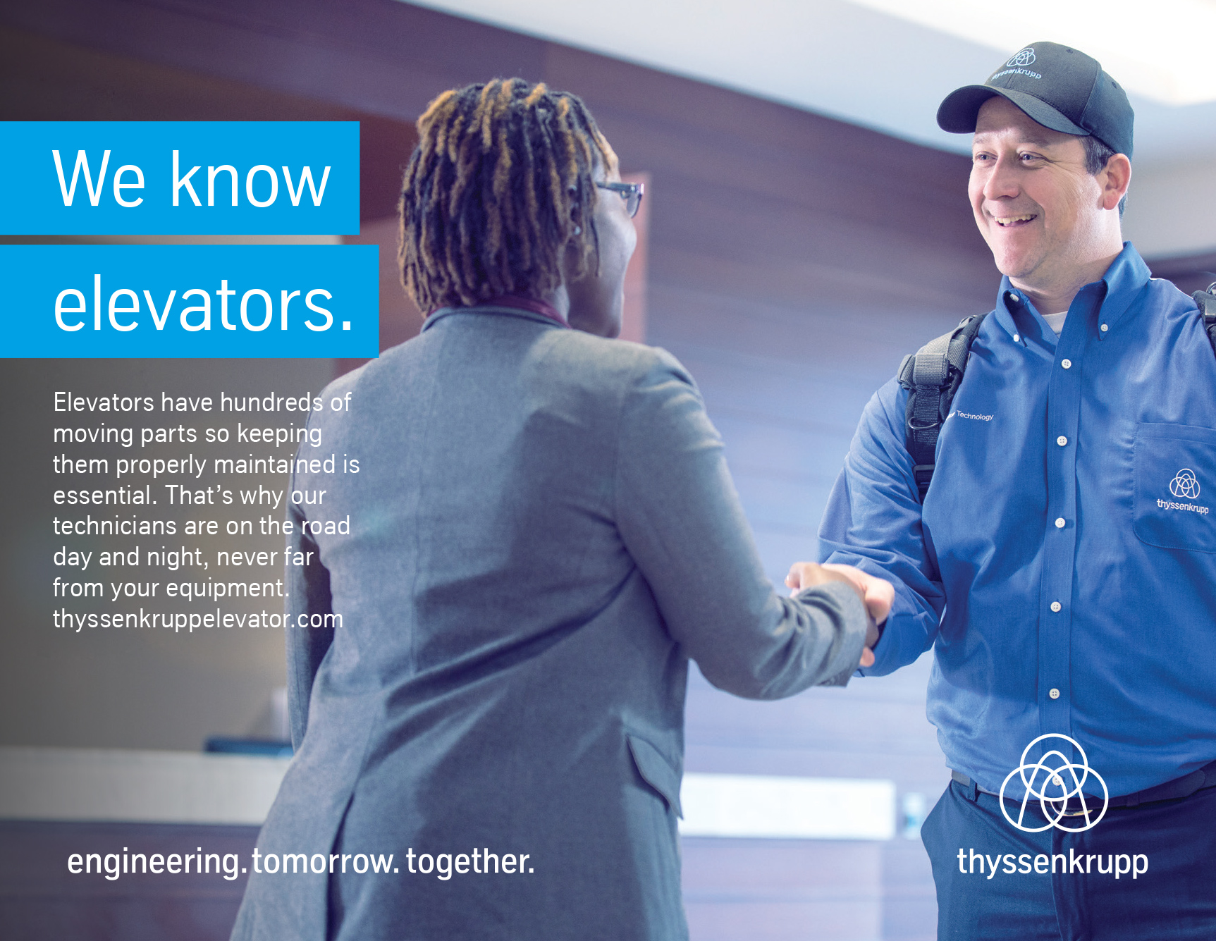
I created a simple institutional ad promoting the service aspect of the company. It is our “go to” ad for tradeshow publications.
